Premier League unveiled a new visual identity for post-Barclays era, and we think it’s a roaring success, this is why:
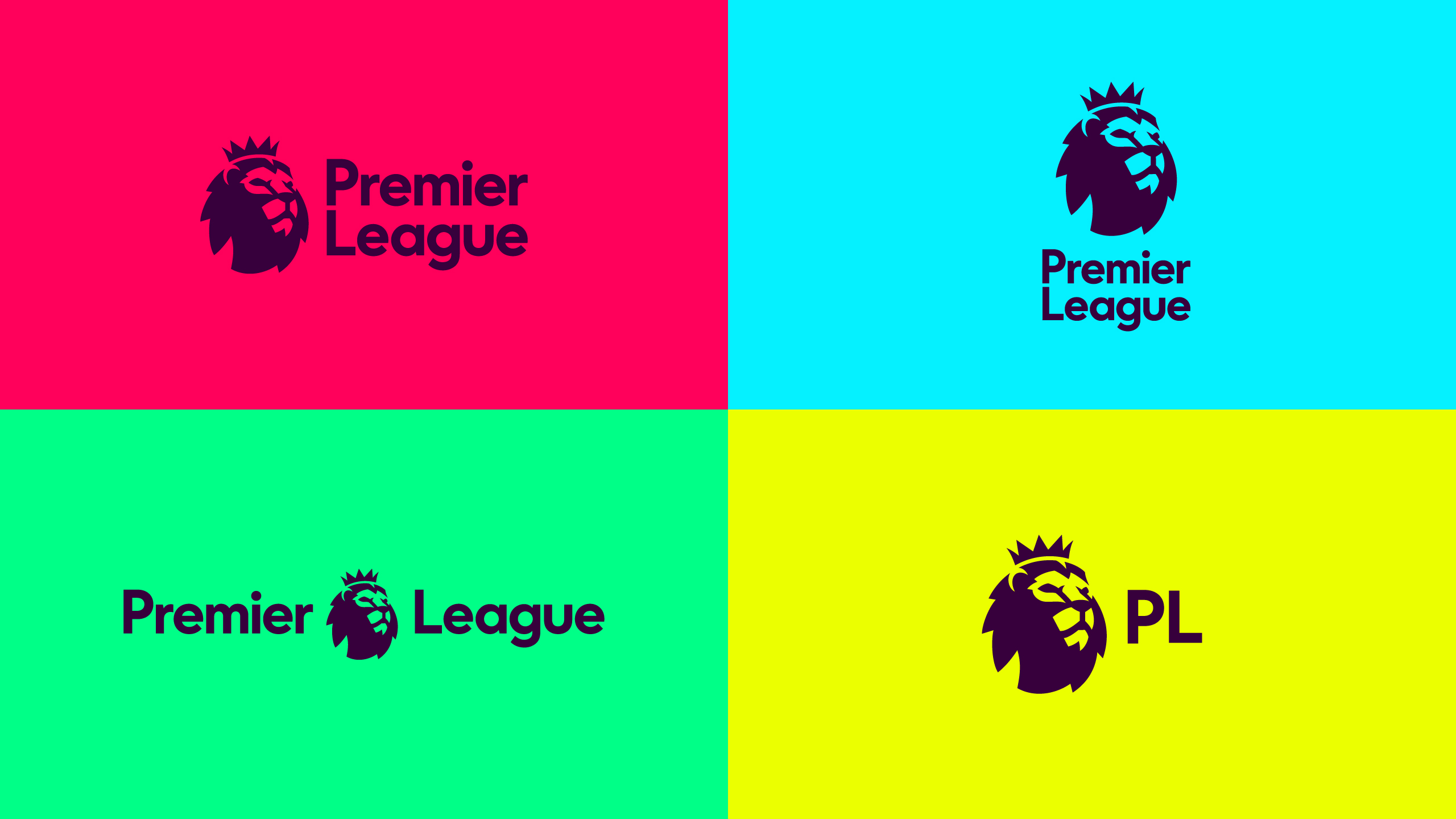
New visuals of the Premier league rebrand
The new Premier League visual identity, courtesy of DesignStudio, to be used from the 2016/17 season. The brand visuals had started being used early on in the year even before the premier league kicked off.
With such a monolithic presence on the world footballing landscape, this new rebrand has garnered worldwide attention and of course – as with all major rebrands – an outpouring of opinions.
The new visual identity is devoid of the previous sponsor Barclays, and as such a the new identity features a simpler layout – which interestingly doesn’t even include a football.
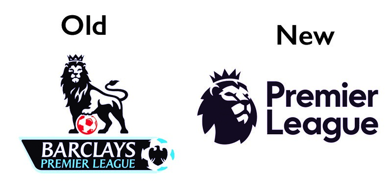
The Old VS The New
Here’s Our Take on Why we Think it’s so brilliant
- The new typeface used is a big improvement on the previously classic typeface (Premier League font). The new typeface is a bespoke design made for this re-brand. It’s warm, human, approachable and informal as compared to the formal professional look the previous typeface had.
- What the logo does it stand greatly on its own, but when applied to the colours of the 20 teams that make up the Premier League, the simplicity of the logo actually draws attention to itself.
- What the new branding has in abundance is colour. Bright, bold, stunning colour usage. Its edgy, dominant and in your face and offers a feeling of “here we are!”. Its dominance put its back ahead of the Spanish, German and Italian leagues.
- The Colours were also designed to allow for formal applications as well as more light-hearted communications e.g Charity and community projects
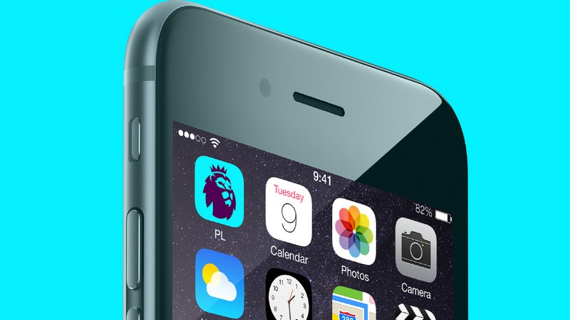
- What we also love is how the logo was designed around the new emblem. What this means is that the new brand is based around the modern digital era and is built from the restrictions and capabilities of digital platforms, i.e. the emblem was made to fit within an icon for apps (as seen below) and then the text and other elements were built in to fit around that.
- What we love most as a design agency is the focus on simplification, none more so than the removal of a football – or anything to do with football. The Premier League has become so well known and associated with the use of a Lion that the need for a football within the logo is simply a thing of the past
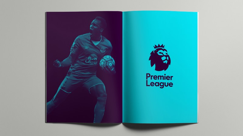
What’s evident is that Design Studio sat down and focused on the relationship between colour, imagery and type. They work seamlessly together, as you can see below, to produce a more exciting overall identity.
The Premier League is now a genuinely international business and, as such, competes with its rival leagues in Europe and beyond. In design terms, the new look compares more than favourably with its competitors who remain mired in the obvious (balls and/or men kicking balls).
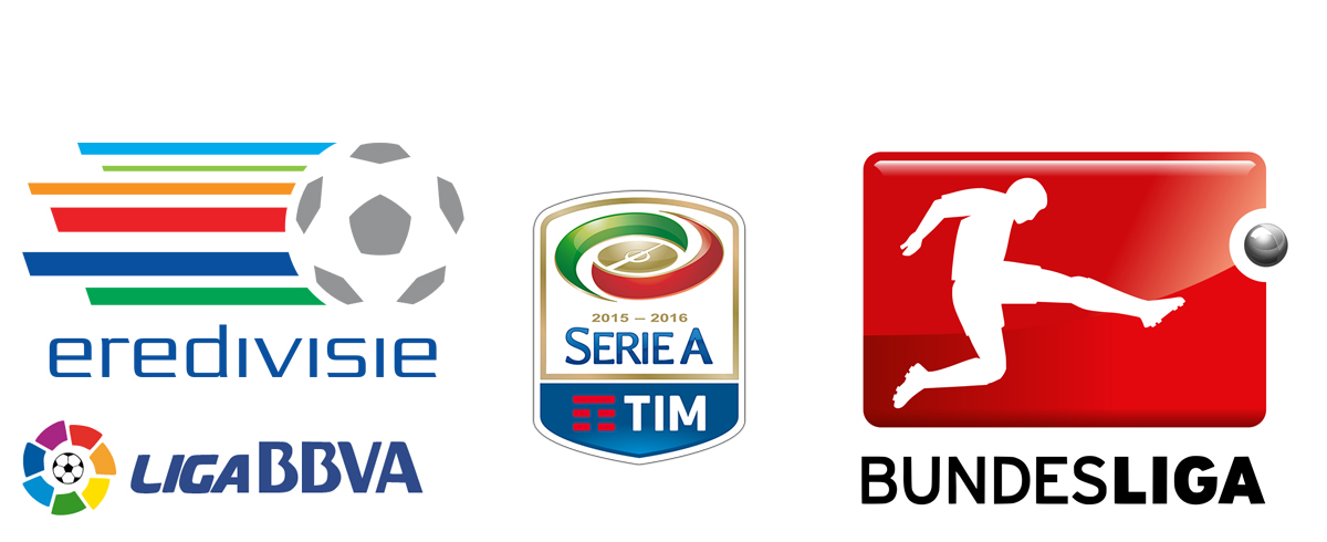
Other Leagues logos comparing to the premier league
Overall, an improvement on the previous logo, and we really do think it’s a wonderfully crafted identity. So it’s a thumbs up from us!
 Contact us to see what solutions we can offer about branding you online


